Families First has some exciting news to share! We are rolling out a new brand and visual identity that together convey the power of the parents in our programs and the strength of the networks they build.
A Refined Focus and a Refreshed Message
WHY NOW? It was time to take a fresh look at our identity and messaging for two reasons. First, we are eager to highlight our refined focus on the early childhood years. Second, we are excited to spread the news about the success of our signature Power of Parenting™ program, which has already shown incredible impact.
We know that words matter, so we enlisted a core team of staff, parents, and board members to refresh our key messaging. As Board Chair J.D. LaRock explains:
“After three decades, our mission remains rooted in the same core elements: working together with parents to build strong parent-child relationships and set kids up for success. But now we have a tighter focus, and with that, a new mission statement.”


These statements reflect our passionate belief in the dedication and leadership that parents bring to their families every day. As Executive Director Sue Covitz says:
“We know that 90% of brain development occurs within the first few years of life, and that all it takes is one stable and responsive relationship with an adult to help children overcome adversity. This presents an incredible opportunity for parents to shape their children’s futures right from the start.”

Board Member and Parent Leader Mirella Cruz knows her strength as a parent and community leader. She says:
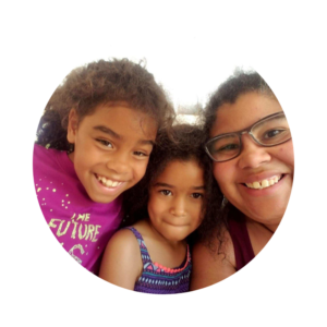
“The Power of Parenting program makes you realize you are not alone. Everyone struggles. As a leader in my community, I am able to convey what I have learned and let more people know they can support one another.”
A New Visual Identity
Artists For Humanity’s Graphic Design Studio collaborated with us to create Families First’s new logo. The team—which included Manager and Mentor Kelsey Arbona and her talented teenage staff—explored a variety of ways to abstractly represent a weaving of shapes.
It evolved into the pinwheel design, in which the individual pieces work together to promote each other’s forward progress. This joint energy and forward motion reflects the progression of parents in the Power of Parenting program, who advance both individually and as a parenting community.
Families First Parent Leader Qin Li agrees:
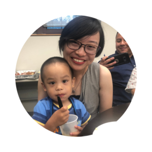
“Like the pinwheel’s edges, everyone has their own personality. Each person has to learn to work together to move the pinwheel forward. The outside edges are our own unique personalities. The inside edges combine together to make us a whole family, a whole community, and a whole society.”
The joining of shapes in our new logo also symbolizes the many voices that contribute to Families First’s impact: parent participants and their families, program partners, staff, board, volunteers, and funding partners.
Artists For Humanity’s Kelsey Arbona reflected on the project:
“Designing the brand for Families First was the perfect project for us. The graphic identity we designed included a pinwheel-inspired logo, a symbol in which elements of various colors and sizes unify to make a cohesive image.
“Not only did our teens love working on this project, but our team was also thrilled, as the missions of Artists For Humanity and Families First as community-based nonprofits align, making our collaboration a seamless process.”
The careful planning that went into this collaborative effort reflects our commitment to the power of parents during the important early childhood years. Together we are building a strong foundation on which the next generation can thrive.

